
Why BrickLink Still Looks Like the Old Internet. 25 Years of Code, Habits and Careful Modernization

Open BrickLink next to almost any modern marketplace and the difference is immediate. The site is dense, highly functional and often unapologetically technical. Many screens feel closer to the web of the early 2000s than to contemporary e-commerce.
That impression is real, but the explanation is more interesting than saying the design was simply neglected.
A 25-year-old system carries history inside it
BrickLink launched in 2000. It was not designed around today’s mobile-first interfaces, design systems or cloud architectures. It grew layer by layer while the marketplace, catalog and community were actively being used.
That matters because what users see on screen is only the visible surface. Underneath are seller inventories, orders, accounts, catalog relationships, search, checkout flows, authentication, historical records and business processes that have accumulated over decades.
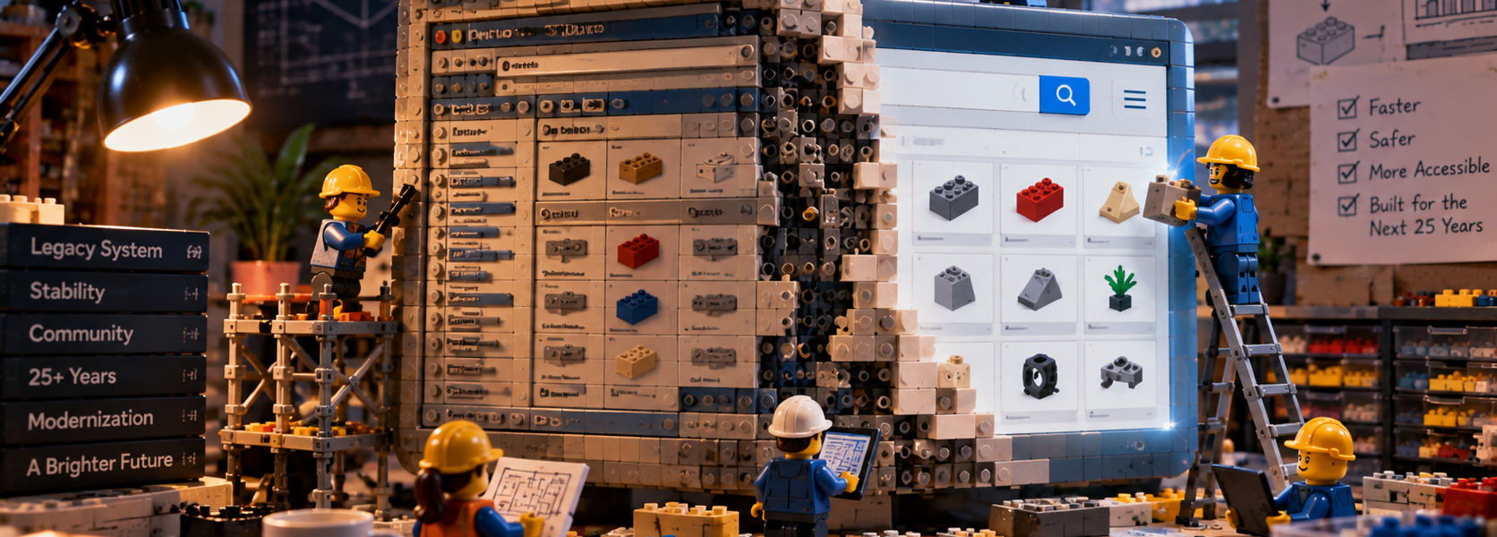
In late 2024, BrickLink explicitly said it was rebuilding BrickLink.com “brick by brick” and replacing underlying infrastructure to improve speed, responsiveness, security, stability and the overall user experience.
For many people, BrickLink is a work tool
A casual buyer may see an old-fashioned marketplace. A high-volume seller sees something closer to specialist business software.
Sellers manage large inventories, orders, pricing and customer communication. Buyers compare stores, part variations, colors, catalog IDs and shipping options. In that environment, appearance is only one measure of quality.
Information density, predictability and the number of actions required to complete repetitive tasks can matter just as much.
That helps explain why a layout that feels intimidating to a newcomer can still be efficient for an experienced user who has learned it over many years.
User habits become part of the system
Long-running specialist platforms accumulate more than code. They accumulate muscle memory.
A seller who processes orders every day may know exactly where a function lives and how many clicks a routine task requires. Moving that function can look like a minor design change while materially slowing down an established workflow.
This creates a difficult modernization problem. BrickLink has to become easier for new users without making experienced sellers less effective.
The rebuild is already underway
In December 2024, BrickLink introduced an updated navigation system and described it as an early step in a multi-year rebuild.
The company said the work would lead toward a more mobile-friendly and responsive website, improved checkout flows and a simplified authentication experience using LEGO Account. It also cited evolving privacy requirements across different countries and regions as one reason the underlying platform needed to change.
In other words, the old technical foundation is not an issue BrickLink is ignoring. The company has publicly acknowledged it and is replacing it in stages.
Why not redesign everything at once
From the outside, the obvious solution seems to be a complete rebuild: design a new interface, move the data and switch over.
For a live marketplace, that approach carries enormous risk.
BrickLink supports real businesses and real transactions. Changes can affect seller processes, integrations, inventory behavior, search, checkout, account access and regulatory compliance. A visual improvement is not useful if it destabilizes the systems underneath it.
That is why backend work can matter more than a dramatic homepage redesign. Authentication, privacy, security, infrastructure and reliability may be largely invisible, but they determine whether the marketplace can continue to operate.
In 2025, BrickLink leadership again spoke publicly about substantial investment in IT infrastructure and foundational work intended to support the platform for another 25 years.
The old-school look is partly historical DNA
BrickLink grew out of an internet culture where utility came first. The job was to identify a part, search inventory, compare sellers and complete an order.
That heritage remains visible in the interface. Dense tables and technical terminology can be difficult for beginners, but they also allow experienced users to see large amounts of information quickly.
Old-school therefore does not automatically mean useless. The problem appears when the historical interface begins to conflict with mobile use, onboarding, accessibility, security or contemporary regulatory requirements.
The hardest part is preserving speed while reducing friction
BrickLink now has to satisfy two audiences at once.
New users expect a cleaner, more intuitive and mobile-friendly experience. Long-time sellers and buyers often depend on existing workflows and information density.
That tension helps explain why modernization has to be incremental. BrickLink is not an empty storefront that can be reskinned every few years. It is a 25-year-old marketplace with accumulated data, processes and user habits.
An old interface does not mean nothing is changing
The most useful conclusion is less dramatic than saying BrickLink has simply failed to modernize.
BrickLink still looks old-school partly because it is, in a literal sense, an old system that must be rebuilt while remaining operational.
Its interface reflects technological debt, historical decisions and the needs of users who rely on it as a working tool rather than a casual shopping destination.
The rebuild is already happening. The real challenge is not whether BrickLink should change, but how much of the old system can be replaced without removing the efficiency and familiarity that made it valuable in the first place.